The Tower Bridge (comments)
Displaying 1 - 17 of 17 comments

I love london so much.. but like everyone said the name is wrong. other than that i love the layout =D
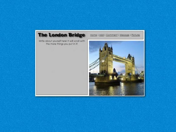
this isn't the London bridge its the tower bridge of London


IVIike if you dont have anything nice to say dont say anything!
And BTW I MADE THIS AS A REQUEST!

i would have rejected this... it's nothing special it's just an image and some basic coding :X

wwooo thats in my city...
but not really that one.
the original one.
Well thanks everybody that said good things and to people who corrected things and other stuff, THIS WAS MADEE AS A REQUEST FOR SOMEONE! Thats what they wanted so I made it exactly how they wanted it.
♪London bridge is falling down, falling down, falling down~~♫ xDDD
(Sorry, couldn't help it. >.^")
ANYWAYS! Neat layout! I think it would've been better if the background was a different colour? But this layout is still good. ^^v


Yeah, that is the Tower Bridge. The original "London Bridge" is actually in Lake Havasu City, Arizona now...lol. They bought it in 1968. A bit of a history lesson I know but I retain things like that :p...I love the layout though.

i love the layout :) but just so you know thats tower bridge not london bridge. lol. london bridge is this boring bridge. i know this because last year when i went our tour guide told us. but still i like it a lot!

True the background is a bit iffy, but I like the layout nonetheless.

didnt i reject this before? anyway, i see that you fixed the border width, but didnt take my suggestion about the background. it's really clashing.

I agree with mlo the pimp; the nav is great. But the background doesn't do it for me, nor the drop shadow or "The London Bridge" text. In FF, there is a color difference in the London Bridge text and the rest of the box. It's kid of weird. This is a very specific layout, too, but overall, I really like it.

i agree with amy innocence but i feel like this is one of your best--it's simple and clean. doesnt look completely out of place.

i think the "The London Brisge" text looks a bit out of place but other than that i love it

Add Comment
You must be logged in to comment