Designer's Comments
Look carefully for specific instructions
e-mail: ale@alecreations.net
website: http://alecreations.net/tutorial.php
DO NOT STEAL MY CODING AND/OR EXACT IDEAS; AND DO NOT REDISTRIBUTE. IF I SEE A LAYOUT OF MINE AND YOU CLAIM IT AS YOURS, I WILL DO WHATEVER IT TAKES TO HAVE IT REMOVE.
Using This Layout
For specific instructions read designer's comments
- This is a div overlay layout, html knowledge required!
- 1. Log into myspace.com
- 2. Click on Edit Profile (Profile 1.0)
- 3. Copy (ctrl c) and paste (ctrl v) code to the specified fields
Layout Comments
Showing latest 9 of 9 comments

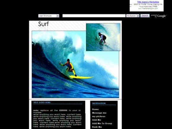
i like how its laid out and everyhthing from the nav to the comment boxx but i hate the picture.

love it! [x

thanks for the comments and suggestions. :) anything that leaves a space can be fixed by adding stuff to it.
i couldn't find any other image. im not into surfing. :/

this is nice but should make icons bit bigger there is a huge space under video
might should of used for icons
but other then that 4.5/5

well I like it. the img could of been a little better, other than that its great. thanks alot =]

im not so sure about the white background. i think u should've chosen dark gray or something. the image isn't that great either. for FF, the navigation is a bit messed up.

ooohhhh i likey.
its not covered. it only shows it like that on the preview.

You should really stop covering the ad with the layout image
Layout Details
| Designer |
alecreations
|
| Submitted on | Nov 23, 2007 |
| Page views | 20,943 |
| Favorites | 87 |
| Comments | 9 |
| Reviewer |
S-Majere
|
| Approved on | Nov 23, 2007 |