hey there (comments)
Displaying 1 - 14 of 14 comments

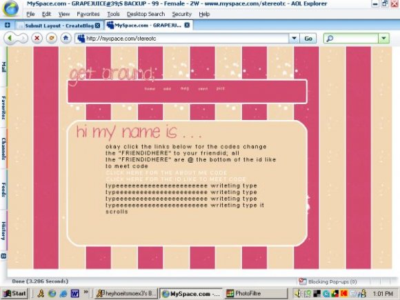
i love it!! i would deffinetly use it if it was centered... can u center it ??

Personally I love the color combination, but I do agree about the nav area...
The colours are cute, but yeah, I think it would've been better if more was done to it.

i know i know i didn't really like it either but i wanted to see what people though im going to add one that I think is bettter so i guess we will see
really really cute. i'd use it if you'd fix what everyone else said :]
i do think it would look better in the center,
but it still looks good.
i love the style/colors :)
if you could remake it so its centered then i would deff. use it!
great first try

Pretty much what everyone else said: More could have been done, especially with the nav, and you can still see parts of the original myspace profile.
I don't want to sound mean, but it doesn't look like much effort was put into this. It's just a background with a content area and navigation thing.
I like the colors though, they make me think of PB&Js =)

i agree with joespace. i don't like the background. and the content area space is like 1px misaligned from the backgound. and i think it should've been centered. and im not so suer about the colors. itself it would've been nicer but combination...not so good.


Add Comment
You must be logged in to comment
Layout Details
| Designer |
speakout
|
| Submitted on | Nov 22, 2007 |
| Page views | 23057 |
| Favorites | 173 |
| Comments | 14 |
| Reviewer |
themarkster
|
| Approved on | Nov 22, 2007 |