Paul Frank & Friends (comments)
Displaying 1 - 11 of 11 comments


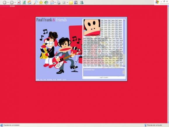
i agree with schizo. i think u should bring it down a bit cause the drop-down menu is on the content area.
Posted by twodreamlovers on Nov 19, 07 10:44 pm


The navi is a wee bit too small. It might have been better if the background colour was less intense.
But other than that, awesome job on the layout!! xDDD
The picture is sooo cute, lol.
Posted by DelicateLove on Nov 19, 07 5:23 pm


i dont like how it has a scroll bar at the bottom its nice though but yeah red an intense color but i dont mind it :D
Posted by BrandonsWife on Nov 19, 07 3:08 pm


Page 1 of 1
Add Comment
You must be logged in to comment
Layout Details
| Designer |
delicioustyle
|
| Submitted on | Nov 19, 2007 |
| Page views | 11778 |
| Favorites | 71 |
| Comments | 11 |
| Reviewer |
tripvertigo
|
| Approved on | Nov 19, 2007 |