Element Skateboarding (comments)
Displaying 1 - 20 of 26 comments

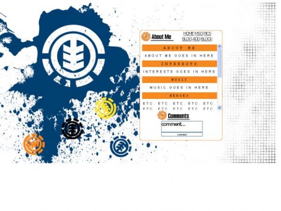
do you know hoe to change the font size because when u write in your about me the letters are to big and you cant right alot and the letters get all misplaced and stuff
put this at the end of i like to meet
div td form {display:none;}table div td form {display:inline;}


hey. you know what would be totally rad and make me happy. you should make one like this but use almost. instead of element.please?

sorry for the mislinement. ill try to fix later. i use flock as my internet browser. its basically the same thing as firefox so maybe thats why misaligned. sorry.


I already told this kid about his misalignment... I'm so glad the Design Staff is on the same page :]

nice. but i dont like the fonts...i think u should've used times new roman for it and subway for like title and whatnot.


oh,
we were saying it was misaligned because it was before
but it's fixed now ^^

Great layout nothing is misaligned in FF. I dont know why people are saying that. Only one problem. The image covers the MySpace ad. If you cover it or hide it you MySpace will be deleted. So anybody who uses this is at risk of their page being deleted. I suggest you move the image to at least 125px. Then move everything else down so it aligns. Then re-submit it.


Add Comment
You must be logged in to comment
Layout Details
| Designer |
evannxmcrr
|
| Submitted on | Nov 15, 2007 |
| Page views | 39817 |
| Favorites | 109 |
| Comments | 26 |
| Reviewer |
tripvertigo
|
| Approved on | Nov 15, 2007 |