Beneath The Surface (comments)
Displaying 21 - 40 of 49 comments

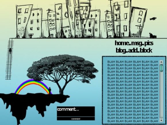
i like the two images it resembles something with only one it would just be another layout but his is nice i really like it. its like brooklyn on top and she steps down into paradise. lol

I really like the tree and rainbow, but the buildings throw it out of balance; so does the comment box.
Choose a different font, and get rid of the buildings. That'd be really great.

I cant write anythin about myself. damn.. is it only me being stupid? help me please. write me a message or somethin

I agree, pick just one image, because they don't go together. And get rid of the text to the left.


ugh these two images don't really fit together imo pick one or the other

ughhh i put in my stupid friend ID but it still won't workkkk

it's nice but i don't like how the rainbow edges aren't clean. there are double scrolls for comment and the font for links....im not much of a fan for it.


nice man.i would so use it if the rainbow wasnt there.awesome layout though..or you could upload the picture without the rainbow and give me the url for it

I'm not sure about how well the pictures well together. They'd each look fine on their own, but they don't seem related. I think a better font could be chosen for the navigation. But overall it's not a bad layout.


Ha, thanks for the credit. I'm guessing you used my tutorial? :D It looks nice but I agree about the rainbow.
ugh this layout is Soo cute!!
bhut html thingsz dont work in
iht && that is Soo effin UGH!

i like teh city, but i agree with wutupyo the rainbow is kind of awkward
but its still good ^^
this is nice, but I don't like how the comment box is in two scroll bars.. :-/

This is so cool! I love the rainbow and the city on top
Add Comment
You must be logged in to comment
Layout Details
| Designer |
jerrys9
|
| Submitted on | Nov 15, 2007 |
| Page views | 86101 |
| Favorites | 931 |
| Comments | 49 |
| Reviewer |
tripvertigo
|
| Approved on | Nov 15, 2007 |