Icey Heart (comments)
Displaying 1 - 19 of 19 comments


i think it looks simplistic.
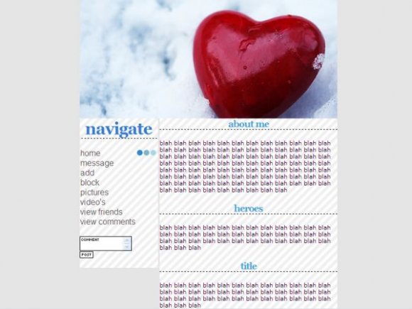
the picture is actually what drew me in.
very nice.
and i like the headings,
i use those alot. [=

You took one of my source code, do you know how to code?.
Let me rephrse that..:Atleast make it... UNLIKE mine. (the bottom code with the nametext and all those codes that hides them).
i figured it looks a little nicer without the scroll box. thanks for the comments though, im learning a lot

I like it a lot but the content section should have a height so that it scrolls, otherwise if you out a lot in there your page would be really long

i think that the goal you set was achieved. i don't really care for the image however.
yea i was going for a clean look.. i should have done something with the banner. thanks for the comments!

I agree that it's a little plain. The rollovers are cute. I like the simplicity of this. And I also like the image. Good job.


i like it but i think you could have done alot with the backround


Yeah, I think you have a really good concept, but the actual execution is pretty weak.
I think the banner could have been pushed a lot farther... Maybe with some brushes?

I agree, this layout is kind of plain. I wish you had used some brushes on the banner since it's a nice image you chose. I do like the rollovers, though.

it's nice but the layout seems awkward and like weak.

it's pretty bland. i think you could have went more with the red
Add Comment
You must be logged in to comment
Layout Details
| Designer |
nikkysummer90
|
| Submitted on | Nov 12, 2007 |
| Page views | 19848 |
| Favorites | 155 |
| Comments | 19 |
| Reviewer |
tripvertigo
|
| Approved on | Nov 12, 2007 |