Broken Hearted (comments)
Displaying 1 - 20 of 24 comments

Hello.
My name is Miss favour,i saw your profile today and became intrested
in you,i will also like to know you more,and i want you to send an email to my
email address so i can give you my picture for you to know whom i am.Here is my
email address (favour50williams@aol.com, ) i believe we can move from here. I am
waiting for your mail to my Email address above. Remember the distance or colour
does not matter but love matters allot in life Yours Love. pls contact me back
with this email address here (favour50williams@aol.com, )thanks.pls don't write
me on the site,please remember that i see others,
but i see you as the best,


OMg OMg OMg Omg(osh)This quote on here i amazing..... I mean it is sooo thought ful and deep and man i love this quote its amazing..... holler

If u are having problems withe friends and a comments showing up- go to scripts and find where it says hide the whole thing or entire layout and paste it ITWORKS!!!!!

Allo, I love this graphic and color. It is a beautiful work. I put it in myspace but I have a problem with the friend and comment. I did put my friend ID where you said. But hat doesn't work. Thank you to help me :)

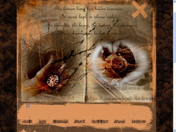
I see the idea you're going for but I think the header looks kind of bad quality wise. The idea and the images are ok. The navigation is humongous it could of been smaller same with the style oft he text area. The brushes seem a little messy as well. The background loks ok but I don't see this layout clashing together to well. Thats just my opinion and criticism :]
The new brown background looks better with the layout. But honestly, most people wouldn't know how to make their own banner to put in above the navigation. I think it would be best if you moved the navigation up even though that'd be a pain. =/


the image quality could be better IMP, but the concept is cool
I don't really like the background, sorry. I don't think it matches with the layout. ^^a
I don't really like the way the words are centered at the top... ><
I like the pictures though! xD


the original layout is showing through from the right side of the image

Yeah, I think it looks better now. I love the background. It reminds me of TDWP for some reason. (:

the background looks wrong with this. you should do a regular color like beige or dark brown color background. just a thought.


I love this layout! Very awesome. Yeah id use it if it wasnt for the HUGE credit, lol. But once thats gone it'd be aweomse
xx
Add Comment
You must be logged in to comment
Layout Details
| Designer |
endingxinsight
|
| Submitted on | Nov 10, 2007 |
| Page views | 39197 |
| Favorites | 208 |
| Comments | 24 |
| Reviewer |
tripvertigo
|
| Approved on | Nov 10, 2007 |