Using This Layout
For specific instructions read designer's comments
- 1. Log into myspace.com
- 2. Click on Edit Profile (Profile 1.0)
- 3. Copy (ctrl c) and paste (ctrl v) code to the specified fields
Layout Comments
Showing latest 5 of 5 comments

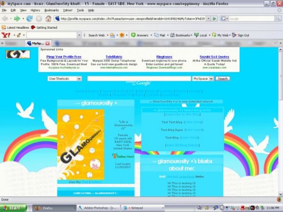
Very bad quality in the background. That's why I don't like it. It's also tiled which turns me off.
By PCDKitty on Nov 14, 2007 7:38 am

Aww~~ I love the background! =D
By DelicateLove on Nov 10, 2007 9:57 pm

this is so bright i like this a lot. i agree with schizo, too.
By jesusisthebestthing on Nov 10, 2007 5:54 pm
The blog looks normal in the screenshot, but it's not the same width as the sections below it for me. =/ I agree with schizo that the content area and friends space should be a different color that stands out more from the background. The background is cool. :]
By tokyo-rose on Nov 10, 2007 12:48 pm

The background is awesome, but I think a different color for the content areas (or whatever you call them) would be nice. Good job though. :D
By schizo on Nov 10, 2007 11:41 am
Layout Details
| Designer |
glamourosity
|
| Submitted on | Nov 9, 2007 |
| Page views | 24,799 |
| Favorites | 108 |
| Comments | 5 |
| Reviewer |
digitalfragrance
|
| Approved on | Nov 10, 2007 |