Lined Paper (comments)
Displaying 1 - 20 of 21 comments

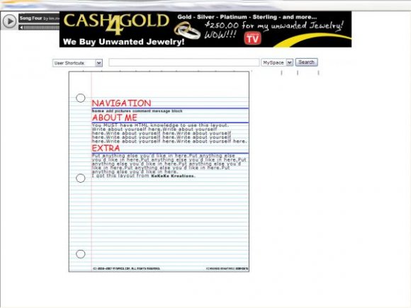
it'd look better if the font was like a handwriting font or something... or if tehre was doodles off to teh side of teh papper... and if it was a tad bit bigger..... [[[ soz if im complaing too much.]] i reali do like the idea tho. and no. im not gunna steal it. lawlz.

a lot of people have already done something like this and your version is sort of eh.

It's alright. Like everyone else said, you've done more with it. =/

this is nice, but there's one on the site that has this same concept. the truth is: you could have done A LOT more with this lyt.

its ok,
but i think the red and blue r too bright.
i think it shoult be lighter and the paper bigger


yeah, i agree.
the other lay is definetly better.
this is just too plain :P


You wanna plaster your credits on it a little bit more next time? Jesus..

this is just way too plain. i get the whole simple layout thing but this is way too simple. u did better on ur other layout. the least u could've done on this is do something with the titles.


it's been done...a lot better. good concept, not so good execution though. i agree with the comment below, too bright
I think it's a little too simple. The red and blue are a bit too bright, too. :F But it's not a bad layout; some people would like it. =]

Add Comment
You must be logged in to comment
Layout Details
| Designer |
KeKeKe-Kreations
|
| Submitted on | Nov 9, 2007 |
| Page views | 32592 |
| Favorites | 111 |
| Comments | 21 |
| Reviewer |
digitalfragrance
|
| Approved on | Nov 9, 2007 |