Expressions (comments)
Displaying 21 - 31 of 31 comments

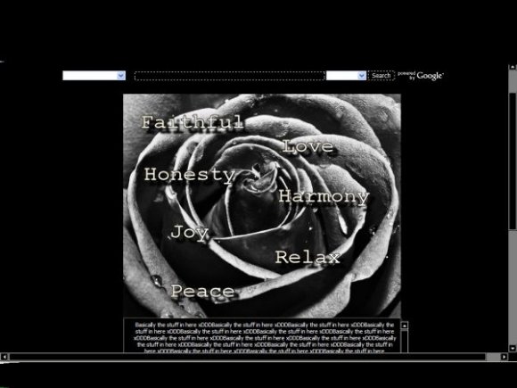
I think the banner is a little too big and that the text is kind of random. The banner would be fine if it were blank. Did you feel like you needed to put text to fill up space? As for the navigation, maybe you could put in links right about the content area.
And people, learn how to read the other comments before asking about the navi. She's answered that question four times.

I understand. It's not that hard. Just STOP complaining about it, I notice that there are no nav links. Just add your own.

Hate to break it to you, but most people are too stupid to put in their own navigation. I personally would have no problem with it, but you're going to get a lot of complaints.
I cant, everything is already coded. Go to this site:
http://myspace-crash-codes.c om/blog/codes/myspace-contact- links
It has myspace contact links for you. Just add it where you would add your other information, and space it out by using code


You will have to add your own Nav. sorry about that. I had to add something to the picture because it probably look too plain. This took me FOREVER to code.
Enjoy! Keep commenting! I love hearing from you guys.

nice layout, but i think that the words just throw it off...like, theyre too "attention-getting??" i dunno, they just throw me off at least..

Add Comment
You must be logged in to comment
Layout Details
| Designer |
AuFait00
|
| Submitted on | Nov 9, 2007 |
| Page views | 21782 |
| Favorites | 123 |
| Comments | 31 |
| Reviewer |
digitalfragrance
|
| Approved on | Nov 9, 2007 |