iPod touch (comments)
Displaying 21 - 30 of 30 comments

What Does It Mean when you Have to Replace The X's with Your friend Id


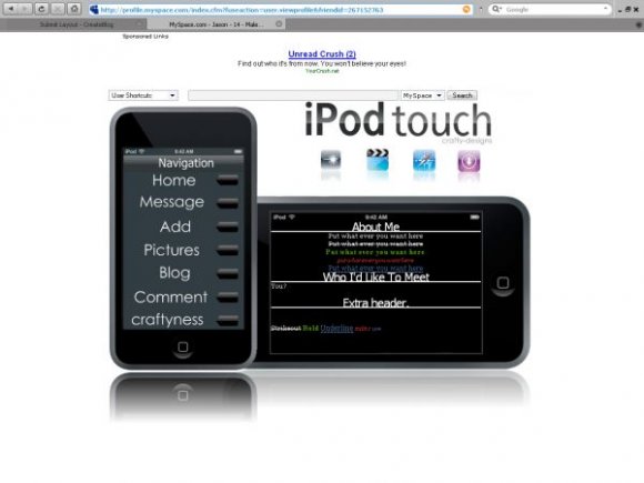
this is cool. i like that this one has more space...putting the nav in a second image of the iPod touch was a great idea. nice work, great execution: i luv it!
lol i like the idea but you should touch up on some things here and there to make it even better.

i agree with mike about this getting old. it's a good concept but i don't think it's executed well at all. i don't like the huge navigation that takes up half the layout

This whole trend is getting real old real quick... IMO a lot could have been done with this such as rollovers and other effects that would have mad it better
This whole trend is getting real old real quick... IMO a lot could have been done with this such as rollovers and other effects that would have mad it better

Nicely done. The enhanced font colors could of been different though. Maybe a bit more realistic?

Great concept, one of the better designs that follows this trend. Fantastic work.
Add Comment
You must be logged in to comment
Layout Details
| Designer |
crafty-designs
|
| Submitted on | Nov 7, 2007 |
| Page views | 72211 |
| Favorites | 354 |
| Comments | 30 |
| Reviewer |
themarkster
|
| Approved on | Nov 7, 2007 |