Frontrow iMac (comments)
Displaying 1 - 18 of 18 comments

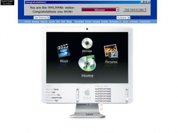
more color would be nice...and a more noticable comment box. It seems randomlly placed. >.>

nice but...i hate how everyone's using a similar idea jus to make layouts.

i thought the comment box was...kinda just thrown there


Oh, not another one XD I think this sort of design has been done to death; and it does still need some work done to it.


love the idea, should improve about te way you made it...see? :)

Nother personal to you, but this style of computer screen layouts is getting old FAST.

I love the idea!
But the plain white background is just too simple, and bare for me.

as much as i love the navigation deal you have going on, i think it wouldve been better if you switched the navigation/ contetn area around. it's really open at the top and clustered around at the bottom.i like the idea though. a v2 would be a good idea. :)
I like the idea, but the NAV is really messed up. It doesn't work well.

brooklyneast05 is right, but i like that u tried to do something different...i think you have a great idea & that you just have to expand on it a tad more.

Alright... could have been better. There are two others better that this one, but I think the Mac OS X Leopard one was the best. This one you focused too much on the nav and not the rest of the layout. You should make a V2.

Normally I'm not too fond of these type of layouts, but this one's pretty nice. Good job.

Hmm...I think I started a chain reaction of apple monitors. LOL
I agree with brooklyneast05.
And the placement of the commentbox is weird..

sloppy looking. the navigation is the focus when the content area should be.
Add Comment
You must be logged in to comment
Layout Details
| Designer |
mikeyMISFIT
|
| Submitted on | Nov 6, 2007 |
| Page views | 34607 |
| Favorites | 153 |
| Comments | 18 |
| Reviewer |
IVIike
|
| Approved on | Nov 6, 2007 |