Lost without you (comments)
Displaying 1 - 17 of 17 comments

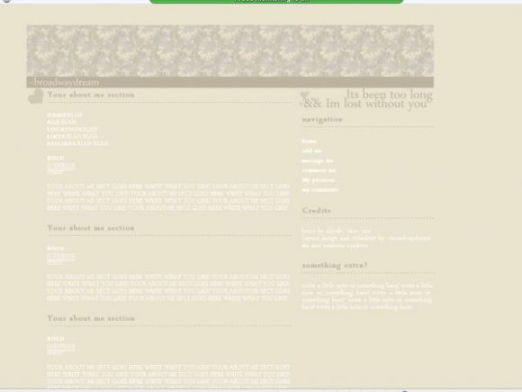
if you think the font is too light. change it yourself. i like the font hat colour thats y i did it. my resolution is also 1024. my idea was for it all to be the sam colour etc.

The text is weird and hard to read being white. You should have made it a dark color.

this is sooo nice! why is it soooo hard to read though? anyways, i luv it & i think i will use it. good work =]

um the font choice could've been a lot better although i really like the lightness of the layout's colours.

This is cute, but the font colours are too light, so it's really hard to see. ^^;;


u can't really see the font that well. u need more contrast. everything just blends in with each other.

Mmm, messed up in IE as well as Firefox. This is too bland, you need some contrast!

this is pretty. but the font is toooo light! or maybe tis my screen hehe

i dont have fire fox so i wudnt know how to make it right

Add Comment
You must be logged in to comment
Layout Details
| Designer |
--broadwaydream
|
| Submitted on | Nov 6, 2007 |
| Page views | 16696 |
| Favorites | 52 |
| Comments | 17 |
| Reviewer |
digitalfragrance
|
| Approved on | Nov 6, 2007 |