Breakaway... (comments)
Displaying 1 - 15 of 15 comments

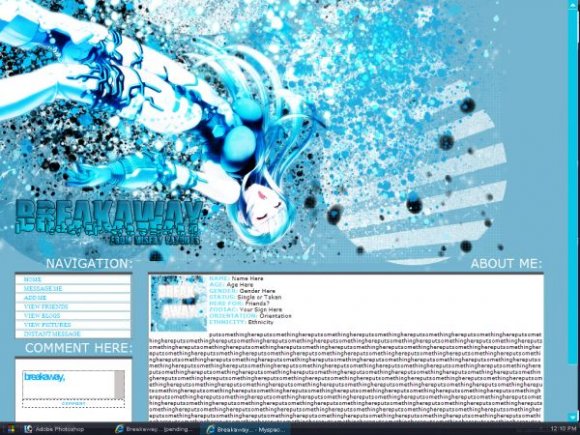
TOO MUCH BLUE. I like the layout but theres too many brushes and TOO much blue.


big credit, busy image & very small font. i don't get it.

You always have so much going on in your layouts- I love it :) this one is probably my favorite out of all of your designs. Nice style, keep it up!

Yeah. Sorry for using the same brushes all the time, I just really like using them, but thanks for the comments and tips for my next layout, you guys. ^___^;;

you tend to over use brushes which makes all your layouts look the same. IMO the layout looks a bit messy. The font is cool, but thats about it

very nice. although i'm really sure about the really big table.

The layout looks great, but all of your layouts look about the same. Try some diversity.

I LOVE it!!! great job on the entire layout!! I love the imnage!

Add Comment
You must be logged in to comment
Layout Details
| Designer |
MiseryLayouts

|
| Submitted on | Nov 6, 2007 |
| Page views | 25725 |
| Favorites | 130 |
| Comments | 15 |
| Reviewer |
digitalfragrance
|
| Approved on | Nov 6, 2007 |