World Of Craziness... (comments)
Displaying 41 - 60 of 60 comments

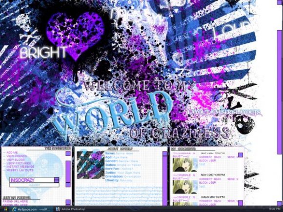
I LUV the setup as well as the color contrasts!!! Im gonna use this one!!Thanks Misery101..My world is a bit crazy (3 teenage boys,a husband,and a host of problems)this one suits me well

OOH i like this it's really cute.
I am so using it.
Mz.Neisha

i love it , but i think theres just a little too much going on and other than dat it great (;


Not taking but I just wanna say, out of all your layouts this one is my favorite. And I actually LIKE how big the header/banner image is..then again i've got a fairly large monitor/resolution..but I still like it! Great job :]

hwy i love all your layouts! you got some bad @$$ talent here girl! :D

I LOVE the fact that you have the 3 sets of boxes!! I have always wanted a lyout like this! Too bad I got tired of using DIV's!! lol. Great job!! It's not too big! The whole idea is craziness!! lol
hah its a good layout. im a dude. and i say this layout is not even remotely gurly

i really like it hehe yea life can be really hectic sometimes pretty colors :D


I really like this actually! I prefer all the white being black though, that's my only change-desicion. Good job!

not really my style but fits the title perfectly. nice tables though.

if the header was just a weeee bit smaller i think it would be great! u should make another one with the same set up like this i love how there is 3 boxes! great work =]]
The banner is way too large for my taste. It isn't a bad layout, though..

Not crazy about it being purple, but it's a nice layout, good job.

i don't think light blue is the best color for the text. i think the far left box with the navigation and what not should be centered and something could be done with the navigation. i like how it's separated into three boxes though. if the main image was more clear this would be a lot better. but still, better than ur previous ones i think


Wow, this is probably one of the most insane layouts I've ever seen. I'm switching to this layout when I change it. It looks amazing, nice job.
Add Comment
You must be logged in to comment
Layout Details
| Designer |
MiseryLayouts

|
| Submitted on | Nov 4, 2007 |
| Page views | 73501 |
| Favorites | 664 |
| Comments | 60 |
| Reviewer |
karmakiller
|
| Approved on | Nov 4, 2007 |