MS Paint (Vista) (comments)
Displaying 21 - 29 of 29 comments

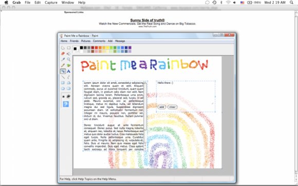
this is just okay. this is only slightly better than the first, i think you should work on where you want to put the text & the comment box. it looks totally out of place to me. i like what you're trying to do, but you've still missed the mark for me.
Posted by jesusisthebestthing on Nov 2, 07 8:02 pm

even though it could be improved a bit, this is still the best paint layout that i've seen.
Posted by coldplayisawesome on Nov 2, 07 4:51 pm


this is ok in my opinion... the words are kind of sloppy and it's not that original, but i'm sure some people will use it
Posted by IVIike on Nov 2, 07 8:59 am

« Prev ·
Page 2 of 2
Add Comment
You must be logged in to comment