Light Blue Silhouette (comments)
Displaying 1 - 15 of 15 comments


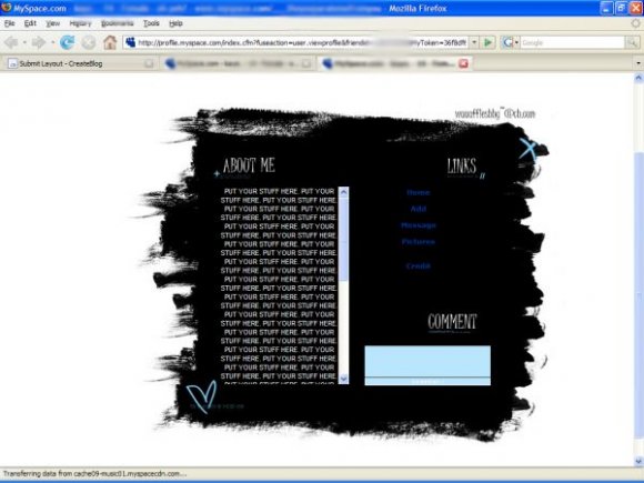
A little simple; you could do with some more effects to liven it up: but a good first attempt.

Whoaw it's overall superb except the nav when hovered. Still i love it though it just needs a little change on the nav.

I didn't know the hover would come out red. Stupid default links. I'll do better next time.

i like it except i don get why you picked red as a color for hover. it's unique...but...it's just...not right for this kind of layout

this is pretty nice. i think you should've made the "about me" text space span across the entire black background & put the nav at the top or the bottom of the lyt. i luv the comment box.

I like this layout alot..
but the nav could use a little work..

the nav is not good, but the rest of the layout is pretty cool

omg yuur the first layout that works for me ! :D :D! Thankyuhh! .. but one fing mi music box is over abit if my "About Me" :S ...Can Yuhh Help! :) Please ! x
www.myspace.com/ohsorando m_x


i think this is great, the only thing i would work on though is the nav and scrollbar.other than that great job.

CUTE!
i love the brush strokes as the border.
its cute, but you could've used some cuter fonts...
good job!
Add Comment
You must be logged in to comment
Layout Details
| Designer |
Persnickety
|
| Submitted on | Nov 1, 2007 |
| Page views | 34976 |
| Favorites | 169 |
| Comments | 15 |
| Reviewer |
IVIike
|
| Approved on | Nov 1, 2007 |