Phantom (comments)
Displaying 1 - 17 of 17 comments

hey shyeah i have a moulin rouge layout for you...contact me when you see this

i really like ur lyts but i was wondering if u could make a moulin rouge one, i would really appreciate it if u did... u can find some cool pics about the movie on google or onphotobucket/icons..... thanx alot
It's about fucking time someone did my favorite musical as well as you have. VERY FUCKING AWSOME! I officially love you ! =]


i agree i like the setup, but i dislike the font that has that border around it, and the banner looks too embossed. other than that, good job. :)

this is a great layout setup however the main banner graphic is too plain

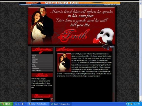
phantom of the opera. classic. i like it although the bright red is a bit too bright.
I don't like the way the font looks. =/ It looks a bit blurry to me... >.>
I think you should change the colours of the outline or something... =T
Other than the fonts, it's good.

What I mean is, it looks like they're off to the left a bit too much. They just don't look like you intended them, in my opinion.

This one is ok... theres something i don't like, but i con't put my finger on it

Nice Layout. LOVE IT!!!
If you make another one, you should SO put lyrics from "The Point Of No Return" on... Or some sort of lyrics from the movie and broadway play.
Looks great, keep up the good work!!

Interesting layout. Though the tables have the wrong settings for width, and hight, or maybe its position, I'm not sure. But I do know the tables aren't actually in the right place. Other than that, it looks pretty good.

everything looks great!
its just id rather have the bakground black..
its something i dont like every time c that background..its awesome!
faves
Add Comment
You must be logged in to comment
Layout Details
| Designer |
xtina
|
| Submitted on | Oct 28, 2007 |
| Page views | 14693 |
| Favorites | 74 |
| Comments | 17 |
| Reviewer |
karmakiller
|
| Approved on | Oct 28, 2007 |