Black Leaves (comments)
Displaying 1 - 20 of 24 comments


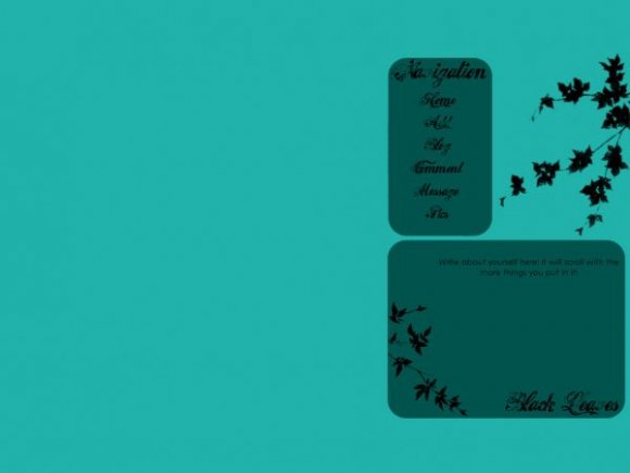
i like it where it is, its different,
its called original

You mean its too far to the right... and well thats how I wanted it to be. Take it or leave it.
GRRR!! I love this but as stated below by sll those people, it's too far off to the left. You should consider filling in the right side with something creative.

it would be really neat if you could fill up the left with a big black detailed leaf.
layout pwnage.
In the CreateBlog perview, it does... but if you use it on your page, it wont show up.
Hey,
the interests, details, about me, who I'd like to meet and URL are all showing up, which kind of ruins this layout... =/


the colors are nice. but they don't compliment each other. and although this is unique...the left side is way too empty.
... First comment was my friend! >.> (She needs to sign up for an account...) Sorry for triple posting! >
It's really simple, but I still like the layout. =]
The only problem I have with this is that it's wayy too far on the right. =/
Aha, this is soo awesome!! xDD
Cool idea!
Especially the navi. x]

For a simple layout, it is very nice. The color is wonderful, and I like the overall simplicity. The only thing I can find wrong is the background colors don't match, but you did a great job!


**looks at other comments**
Okay, I feel totally blind and/or stupid because this layout looks absolutely wonderful to me!
Magnificently done!
Nice work!!
♥
Cmon people you should know. CreateBlog make some table still show in their preview. It wont be there when you use the layout. Also I made the layout to the right side on purpose. Lastly I couldnt choose a color when I was making this layout, so I closed my eyes and clicked randomly. Thats how I got the color. Actually I think the color is nice.

Add Comment
You must be logged in to comment
Layout Details
| Designer |
NICKAWHAT
|
| Submitted on | Oct 28, 2007 |
| Page views | 22804 |
| Favorites | 112 |
| Comments | 24 |
| Reviewer |
themarkster
|
| Approved on | Oct 28, 2007 |