It's too Late to Apologize (comments)
Displaying 21 - 40 of 40 comments

this is awesome. i love it. and its a great song. great job. very unique.


very cool i gotta say...
very different too..
and durh, LOVE THE SONG!

the whole layout is absolutely amazing and the naving is super amazing^_^


wow this is awesome! I love it! One of the few that I'd actually use!

I like the layout but the input text where people would put their stuff is too plain.. you should jazz up the font. other than that... brilliant concept!

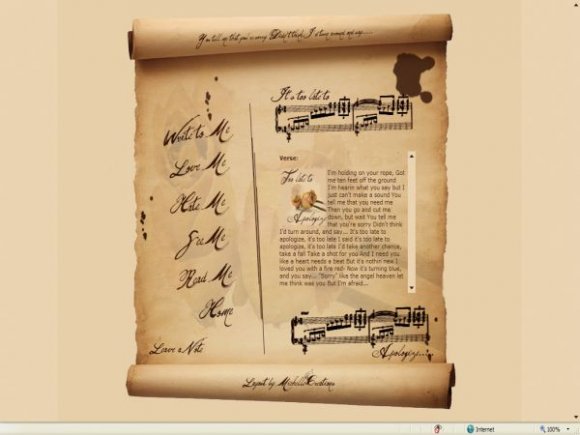
Very nice layout. Like hospitalhorror, I think the text at the top could be bigger.

This is very nice, though I know where the original paper background came from, it was free for use there anyhow. Great job, you made this work very well.


awesome michelle i think if it had rollovers it would have put it over the top

BEST LAYOUT I"VE EVER SEEN!!! I totally lvoe it!! I want to use it, but the writing space is kind of too small for me. I'd need it to be way wdier!! lol. But i absolutely love it!! Fantastic!! your best ever, in my opinion!! thanks!!


I love this song!
I have it on my CreateBlog page right now. I would put this on my MySpace but its a bit too girly. Also I love the way you made it look like an old torn paper.

I think it needs some nifty rollovers, and bigger text for the words at the top. Other than that, I like it.
Good job! (:

i like it, but it reminds me of the declaration of independence i made for history class.
i love the song, too.
Add Comment
You must be logged in to comment
Layout Details
| Designer |
michellekdo
|
| Submitted on | Oct 27, 2007 |
| Page views | 72163 |
| Favorites | 555 |
| Comments | 40 |
| Reviewer |
digitalfragrance
|
| Approved on | Oct 27, 2007 |