Splatter My Love (Misery Layouts) (comments)
Displaying 21 - 40 of 47 comments

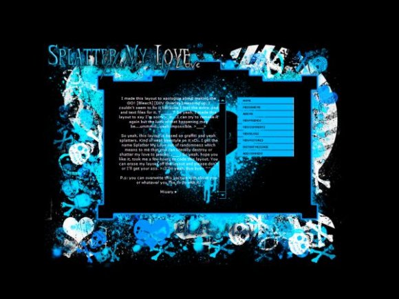
i really loves this layout...
the colour of the layout..awhhh...so cute,nice,beautiful,awesome...
BUT,where is the love that should be on the center background...where??
i hope u willl answer this..

ok this layout is just the coolest one i have seen yet!!! great work!!!!
I'm loving this layout! Its gorgeous.
Is there any way that the Friends Scrolly Section thingy could be turned into a small comment box? And if so, what do I do!?
lol Thanks ^_^
♥

Wow there is just something about this style of layout that I looooove but cannot put my finger on it :) Great job!

Yeah hot pink and neon green is great.
I'll work on that later!~ ^___^;
&& By Ariel293; just a link HTMl code and replace over it.
love LOVE love the layout. I was wondering tho, if u could remake with hot pink and neon green. I love them 2 colors together and no one really makes layouts with them.

i want to have my friends come out in words instead of the pictures. likee it'll have their name and you can just click on it and it'll take you to their page. how do i do that with this layout?

i think this i sjust okay. the about me is hard to read with all the splatter though


very nice but i think the problem is u can't really see the word. try using opacity for the div background.
Love love love the colours&splatters!!
The only problem I have with this layout is the heart behind the words. =T
I think you should move the heart or like, make a transparent-ish box over the area where the words are so the words aren't like, right on top of the heart.

i love how it kills ur eyes haha jk proly will use someday or another =]

Yeah I know. x.X
Just....yeah. .__.
Thank you though. x33
Add Comment
You must be logged in to comment
Layout Details
| Designer |
MiseryLayouts
|
| Submitted on | Oct 26, 2007 |
| Page views | 63059 |
| Favorites | 536 |
| Comments | 47 |
| Reviewer |
digitalfragrance
|
| Approved on | Oct 26, 2007 |