Designer's Comments
Look carefully for specific instructions
Everything else stated in layout code; enjoy.
EDIT: I made the nav a little bigger, I'm not sure what people disliked about it but I figured it probably hurt peoples eyes a bit being such small font.
Using This Layout
For specific instructions read designer's comments
- This is a div overlay layout, html knowledge required!
- 1. Log into myspace.com
- 2. Click on Edit Profile (Profile 1.0)
- 3. Copy (ctrl c) and paste (ctrl v) code to the specified fields
Layout Comments
Showing latest 10 of 38 comments

i like this profile n tried 2 put it on myspace but there r some kinks that i couldn't work out.a lil help please?

can i put a banner on top of this layout??
so, if i want put the banner, where should i put the banner codes??
please help me.. v_v
its perfect! nothing is wrong with it. i usually make all my own layouts so if im using yours...it must be good!
I really like this !
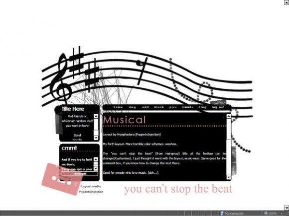
BUT, it really bothers me that the sharps aren't in the right place.
It should be F sharp and C sharp, not E sharp and A sharp.

Light pink and black... love the combination. ^^
The little "shortcuts" thing is sticking out at the top for me. And sorry, things like that rly rly rly bug me... >.
I loved it but my problem is ppl can't see my pics and stuff
How do u add a video icon?

oh, but awesome layout. i used it for a music fanpage i have. =]
I'm trying to put in other links in my about me section and they come up in black so you can't see them. How do you change the color?
Layout Details
| Designer |
PuppetxInjection
|
| Submitted on | Oct 24, 2007 |
| Page views | 81,695 |
| Favorites | 878 |
| Comments | 38 |
| Reviewer |
digitalfragrance
|
| Approved on | Oct 25, 2007 |