(Red)&trade: vs. Div (comments)
Displaying 1 - 12 of 12 comments

i love it ...
i almost bought some product (red) converse.
Posted by confessional-luvv on Nov 25, 07 1:53 pm

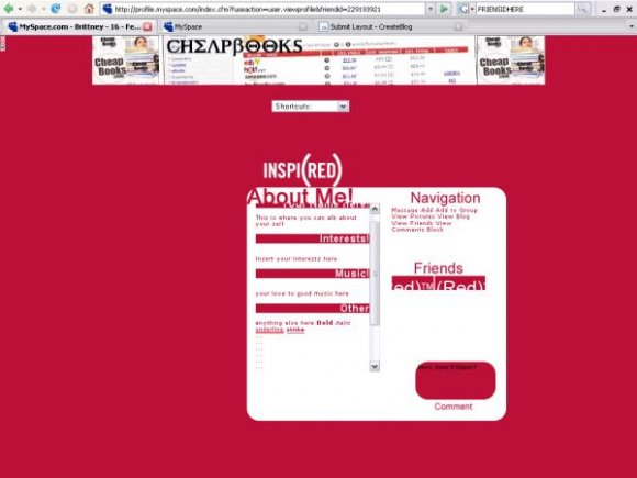
you should remove the blue background because you have the table and then blue and then red at least on my computer
Posted by grrprincess on Oct 29, 07 4:28 pm

this is great. i like everything about this but i think the "friend space" stand out a bit too much.
Posted by jesusisthebestthing on Oct 24, 07 7:25 pm

this is really creative. :D
try adding new codes to hide interests/details, because those show for me on my iPhone here, and I assume that's what mark is referring to
Posted by falsetigerlimbs on Oct 24, 07 5:54 pm


srsly? currently on my myspace none of the stuff is showing up?
Posted by Tripp-ehh on Oct 24, 07 5:16 pm


I can still see a lot of stuff leaking from behind the DIV.
Posted by markmejia on Oct 24, 07 5:04 pm

I like the idea behind this, but I can see the contact table in the preview.
The rounded comment box is adorable. :)
Posted by tokyo-rose on Oct 24, 07 4:50 pm

Page 1 of 1
Add Comment
You must be logged in to comment
Layout Details
| Designer |
Tripp-ehh
|
| Submitted on | Oct 24, 2007 |
| Page views | 20482 |
| Favorites | 87 |
| Comments | 12 |
| Reviewer |
digitalfragrance
|
| Approved on | Oct 24, 2007 |