Spongebob Squarepants! (comments)
Displaying 1 - 20 of 24 comments


i think im going to use this one later in the week. its plain and simple and thats just what i need right now.

hi!
omg i love the spongebob layout!
i grin everytime i see it anyhow whats the use of the friends id?


Updated. Everything is aligned and centered (:
Enjoy :D


How come nobody knows how to truly hide page under the lay? You can see the words under if you open the window completely and have a screen larger than 800 x 600 these guys suck all they do is copycat other codes.

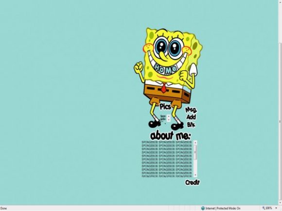
not fond of the home link's position but its super simple... although very misaligned on netscape
Going to fix alignment and put comment box somewhere else and even maybe add the pineapple house :]


i luv spongebob and i luv this lyt, but i hate hate hate where u put the comment box.


Interesting placement of things... overall I think it trned out nice :D

i don't like that the whole layout is off center. the home text is good, the rest just looks throw on there. the comment box is extremely small and also looks throw on there. there doesn't seem to be that much order to anything
Not bad, but there's way too much empty space. You could have put a picture of his pineapple house on the left or something, and/or Gary.

Add Comment
You must be logged in to comment
Layout Details
| Designer |
sweetlylovedlyts
|
| Submitted on | Oct 24, 2007 |
| Page views | 31534 |
| Favorites | 136 |
| Comments | 24 |
| Reviewer |
Insurmountable
|
| Approved on | Oct 24, 2007 |