Designer's Comments
Look carefully for specific instructions
Yay for MAH!
They're good live (Y)
So, the usual replace XXXXXX's with ID. A lot of people who use my layouts have commented me on MySpace, and when I go on thir profile they haven't changed the XXXXXX's. So the links don't work. You must change the XXXXXX's, it's not so important on this layout if you don't do it first time because the link text always stays the same in your profile edit because it's an image map and they don't change. There is a place you need to put your ID in the comment box sextion, it's quite hard to find. I've put it as XXXXXXXXXXXXXXXXXXXXX to make it more obvious.
Don't remove credits... there are two.
The words 'My American Heart' are supposed to be linked to their MySpace, that's not a mistake.
Things I don't like:
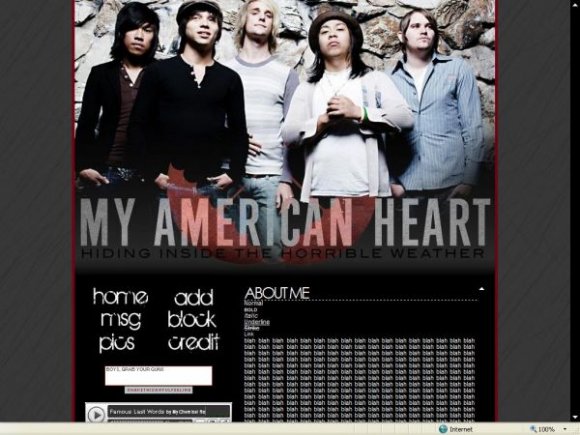
- The image is too wide, it would have looked better if it was the same width as the MySpace ad.
- The left hand size with the comment box, music player and navigation looks a little cluttered. on the cb preview, there's no music so it looks empty. If you don't want music the move the comment box down, but ONLY do that if you know HTML & know what you're doing.
- the subheadings for 'music' & 'who i'd like to meet' (You can change/delete those, btw) have bad colours.
Enjoy!
Credits:
image: www.myspace.com/myamericanheart
background: photobucket
They're good live (Y)
So, the usual replace XXXXXX's with ID. A lot of people who use my layouts have commented me on MySpace, and when I go on thir profile they haven't changed the XXXXXX's. So the links don't work. You must change the XXXXXX's, it's not so important on this layout if you don't do it first time because the link text always stays the same in your profile edit because it's an image map and they don't change. There is a place you need to put your ID in the comment box sextion, it's quite hard to find. I've put it as XXXXXXXXXXXXXXXXXXXXX to make it more obvious.
Don't remove credits... there are two.
The words 'My American Heart' are supposed to be linked to their MySpace, that's not a mistake.
Things I don't like:
- The image is too wide, it would have looked better if it was the same width as the MySpace ad.
- The left hand size with the comment box, music player and navigation looks a little cluttered. on the cb preview, there's no music so it looks empty. If you don't want music the move the comment box down, but ONLY do that if you know HTML & know what you're doing.
- the subheadings for 'music' & 'who i'd like to meet' (You can change/delete those, btw) have bad colours.
Enjoy!
Credits:
image: www.myspace.com/myamericanheart
background: photobucket
Using This Layout
For specific instructions read designer's comments
- This is a div overlay layout, html knowledge required!
- 1. Log into myspace.com
- 2. Click on Edit Profile (Profile 1.0)
- 3. Copy (ctrl c) and paste (ctrl v) code to the specified fields
Layout Comments
Showing latest 6 of 6 comments

i love this layout!
&& i love my american heart :]
seen them in concert yet?
By asdfangelalkjh on Nov 3, 2007 1:01 am

lol oh yah i love my american heart
By ickackrawr on Oct 27, 2007 3:07 am

wow..my american heart is still alive? coollioohh i thought they like broke up or something or they stopped making music.
By snazzyrobot on Oct 26, 2007 10:35 am

at first glance it looks like a default :/
pretty cool :)
By Tripp-ehh on Oct 24, 2007 11:38 am
Ehhh... its alright. Its just simple though. Ther eisn't any real creativity in the design. No offense, its just how I see it. As I said though, its alright. Though I have no idea who that band is... I listen to Metal.
By CreativeArticulate on Oct 23, 2007 8:31 pm

i like the way you did the text
By IVIike on Oct 23, 2007 3:31 pm
Layout Details
| Designer |
heyohereiam
|
| Submitted on | Oct 22, 2007 |
| Page views | 7,806 |
| Favorites | 18 |
| Comments | 6 |
| Reviewer |
IVIike
|
| Approved on | Oct 22, 2007 |