Crash Bandicoot (comments)
Displaying 1 - 12 of 12 comments


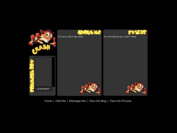
it's too simple. i think u should have a background.


This layout is nice, but it could be much better. You should learn different css properties to learn to center your divs, rather than making duplicate layouts, for different screen resolutions. I think we really have to learn to lose the general look of box column divs. But again, the quality is nice, but it seems to be just three column boxes, with images placed on.

I know Crash is cool... but I really wasnt thinking about making this about the original PS1 games, I made it because I just got the latest game, Crash of the Titans (for Xbox 360).


i love this game;;
its like the only one i know how to actuall play;;
good timez;;
i love it;;!
good job!
I know the nav could have been done more with, but when I was making the background image, I totally forgot about the nav. So thats why I just put it at the bottom. My mistake! XD
BTW I made a version viewable for 1280x1024. But its still pending.


kinda plain and i wish the nav couldve been more creative. i like how the comment box is and stuff and wonder how the scroll bar would look..the font is nice..so overall its not that bad. =]

crash! wow. this is the first layout i've seen of him...probably ever.
but besides that, this is pretty cute, even though it's a bit plain.
Add Comment
You must be logged in to comment
Layout Details
| Designer |
NICKAWHAT
|
| Submitted on | Oct 21, 2007 |
| Page views | 14041 |
| Favorites | 25 |
| Comments | 12 |
| Reviewer |
Insurmountable
|
| Approved on | Oct 21, 2007 |