Leeteuk (comments)
Displaying 1 - 13 of 13 comments

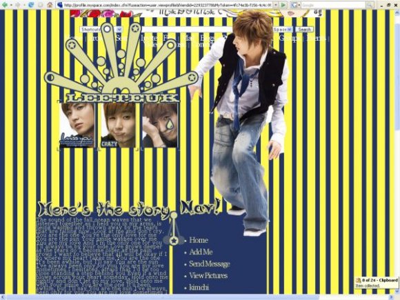
I like this layout, because of the yellow and black stripes, and how the person just stands out of them... even though I have no idea who that person is lol
this layout is so cool. could u guys do a jaejoong layout?? pretty pretty please?

btw just wanted to say this but umm the person standing on the right side of the div isn't teukiee ! its actually bihyul un'e from the group seal.

Can you make me a layout kinda like this but with the Jonas Brothers. Its for my myspace fansite. Please add it too (myspace.com/jonasbrothersareo urlives)
Message me if you think you can do it. Thanks.
I think you should bring down that sun thingy with the three smaller piccys of LeeTeuk down closer to the boxes cuz the gap is really big IMO...
Other than that, AWESOME!! I love it! =D
Oh, hallo thar leader 씨! XD
I think you should make regular layouts for myspace, too. Because your kpop layouts are so nice. :P
I don't like the yellow stripes in the background; they're kinda blinding. :/ The insets of his face are nice though.


Yes, I agree with SinfullySweet.
The content area does seem a bit too crowded while the navi is the complete opposite lol.
Good job still.
Keep practicing!~

This is nice.
But, these are really huge factors that bug me about your layouts. The transparency of your layouts, alot of browsers, such as I.E. 6 and under, does not support transparency in images, so the thre transparency wont appear, and will be replaced by a sort of grayish background.
The content area. It seems a bit cluttered, and squashed together.
As for the navigation, it is the exact opposite. The navigation is really spaced far apart, and has alot of emtpy space. I do like the comment box though, its really cute :]
Just work on those things.
Add Comment
You must be logged in to comment
Layout Details
| Designer |
Saikou
|
| Submitted on | Oct 17, 2007 |
| Page views | 16150 |
| Favorites | 51 |
| Comments | 13 |
| Reviewer |
digitalfragrance
|
| Approved on | Oct 17, 2007 |