Designer's Comments
Look carefully for specific instructions
Tested in Firefox and Internet Explorer; seems to work in both.
Using This Layout
For specific instructions read designer's comments
- This is a div overlay layout, html knowledge required!
- 1. Log into myspace.com
- 2. Click on Edit Profile (Profile 1.0)
- 3. Copy (ctrl c) and paste (ctrl v) code to the specified fields
Layout Comments
Showing latest 10 of 16 comments

pretty & simple .
red rocks !
:D

cool
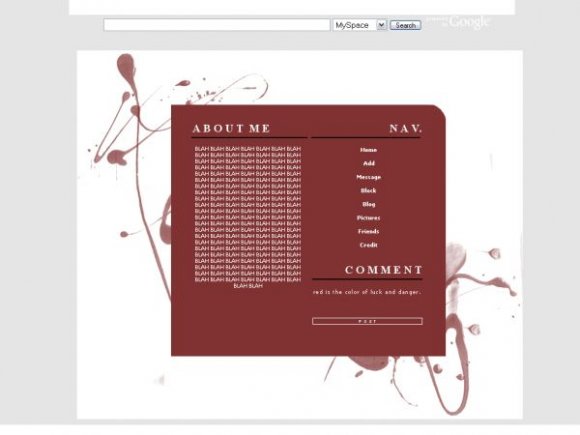
Oh, I get it now. On my screen resolution, the background IS white. There's no light gray whatsoever. It's just higher resolutions.

I'm thinking what you mean (RogueVanity) Is that the background on the image is white? But what we mean is the background behind the image would be best in white...
I really like this overall with a couple minor things I don't like they background color & also I feel the nav takes up too much space... but that's just me...
anyways, great job
Nice simple design here. Though I'm not much of a fan of simple designs, but you still pulled this off rather well. If I used Simple layouts, I'd use this. Much respect.

i love it. simple and cute. im not sure if you intended to make the background light gray and then white..but thats what im getting. and i guess thats why everyone is saying it be better if it was white? [if i make sense] =/ good job though! :]
Thanks for the comments + favs everyone!
"white background would look better, esp for bigger screens"
Sorry I don't quite know what you mean.. the background is white? Or do you mean the background of where it has the text?
Simply beautiful. =]

i simply love it, reds my favorite color, and its simple, but it just jumps out at you,
kudos! :)

white background would look better, esp for bigger screens