Designer's Comments
Look carefully for specific instructions
Replace all "YOUR FRIEND ID HERE"'s with your Friend ID.
Other than that, your fine. :)
Please only fiddle around with things in the "I'd Like To Meet Section. :)
Unless you have the main knowledge of HTML, please, just leave it.
Using This Layout
For specific instructions read designer's comments
- This is a div overlay layout, html knowledge required!
- 1. Log into myspace.com
- 2. Click on Edit Profile (Profile 1.0)
- 3. Copy (ctrl c) and paste (ctrl v) code to the specified fields
Layout Comments
Showing latest 6 of 6 comments

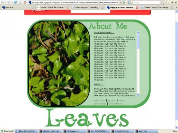
blurry

Well, I like that you fixed the title and the font.
(:

Surprisingly, i agree with absolutely everything everybody here is saying, and i'm not even going to argue it.
I guess i just rushed it, and never really took the time to think it out.

this looks very un-done...
i hope this wasn't done in photoshop or psp.
the greens don't go that well together, and everything looks like you didn't know where to put it. Times isn't really a good font, especially not at that size. The image isn't that good, and all the text is pixelly.
although, i do have to say; the alignment is perfect, and that's the harded part of making a DIV.
(By the way.. don't you mean Leaves of 'Life', not 'Live'?)

in my opinion,
everything seems a bit blurry. the picture isn't very good quality, and the text, especially the "leaves", is very fuzzy around the edges.
I also think you should've done more with the headers of each section, ie: Your Name Here, Movies, Heroes, ect.
And I don't like the nav..
it's very like "stuck-on".. like you didn't know where else to put it.
And the combination of all those greens aren't my top choice...