Close your eyes. (comments)
Displaying 21 - 40 of 41 comments

i like all of this except the nav i think navs should be separate from everything else

haha, i read teh info and i loved that first line XD yeahh, an di love that song superman too :] by five for fighting right?


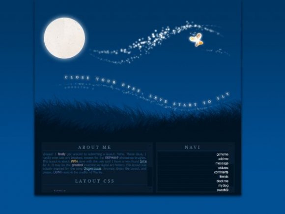
I really like the butterfly in the banner. It's a nice contrast to the darkness of the sky. :D

I agree it looks like the Lunesta a bit, but it's pretty good


It's good. I like the font, don't care what others think. That's my donation to your "noob criticism".
love the colors and the banner. this is just stunning~ =D


beautiful image and welcome back. i was waitin for your layouts for a long time. your layouts are always beautiful

this is sooo great. im thinking about using it. great work, as usual :D

it's really pretty :) but i think the font should be a whiteish color, so that it's more readable O:

HAHA
Looks like the Lunesta (IDK if spelt correctly) commercial.

This is great! :] i love it :) Colours go really well :) I feel sleepy looking at it :)


this layout is really nice, it gives a soft touch to it.
:)
Add Comment
You must be logged in to comment
Layout Details
| Designer |
IBangBaby
|
| Submitted on | Oct 7, 2007 |
| Page views | 58001 |
| Favorites | 604 |
| Comments | 41 |
| Reviewer |
themarkster
|
| Approved on | Oct 7, 2007 |