a l o n e (comments)
Displaying 41 - 49 of 49 comments

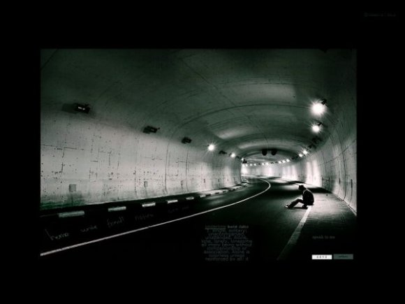
nice concept, great picture, the rest isn't that well done, not near enough content room
Posted by brooklyneast05 on Oct 7, 07 1:15 am

i'm kind of pissed because this layout could have been amazing... if you added a bigger content area some rollovers and possible some brushes. I like the concept though
Posted by IVIike on Oct 7, 07 12:23 am


The scroller doesn't work with FireFox, not sure about IE though.
Posted by Ademisk on Oct 6, 07 10:51 pm


Add Comment
You must be logged in to comment
Layout Details
| Designer |
lolitalove
|
| Submitted on | Oct 6, 2007 |
| Page views | 78005 |
| Favorites | 589 |
| Comments | 49 |
| Reviewer |
Insurmountable
|
| Approved on | Oct 6, 2007 |