a l o n e (comments)
Displaying 21 - 40 of 49 comments

Wow,
this is Good
I love it!
I think this is one the best on Cb

Need help iwanna use this profile but its comes up in cmmt box form can someone help me

Oh wow.
I totally admire this layout.
And I want to use it so badly.
But when I enter the code, the whole layout is in the comment box.
Help please? >

i was also wondering if there was a way to get rid of the link?
hey...ummm i could only find one set of XXXXX to alter. and so now i cant have people msg me, or comment, or read my blogs, etc...i was wondering what i am missing.

hey i put this layout for my profile in myspace. im really sure how it works. someone help me out???

Guys. people have different settings even if its firefox or internetexplorer , they can change their settings when viewing websites like the font size and font, and EVEN IF THERES HTML ON A PARTICULAR MYSPACE THAT CHANGES THAT, it still alters it a little, (most likely, the font size they chose) so dont be suprised if it is misaligned or distorted in some way. people have many different settings for different things.

i like it, the text is a little on the dark side making it hard to see-but otherwise its cool

No home / writ has appeared check...
http://profile.myspa ce.com/index.cfm?fuseaction=us er.viewprofile&friendid=551042 17

i like it, but i agree that it needs a little more work to be better. Good Job though! :D

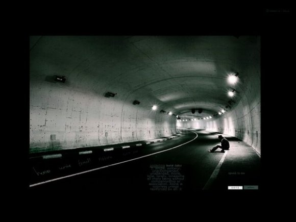
the image is striking, but the rest of the lyt doesnt meet the standard set by the imagery. there isn't enough space to write an about me or interests...
The image is nice, but the About Me area could be a lot bigger and have more a more readable color for the text. The comment box's font is also hard to read. =/

:( I tried it in mozilla It is misaligned, I edited it and now its aligned.....
.section3{
position: absolute;
margin-left:-350px;
top: 464px;
width: 500px;
height: 270px;
overflow: auto;}
Also could you make the content area a little bigger?

UMMMM I HAVE A QUESTION. IS IT A DUDE OR A GIRL IN THE PIC?NICE LAYOUT

this is a good picture.
however the navigation is off on it.
i like the idea that you had... but over all, i just think it is a little tooo simple .. there just isn't much too it.
Add Comment
You must be logged in to comment
Layout Details
| Designer |
lolitalove
|
| Submitted on | Oct 6, 2007 |
| Page views | 78005 |
| Favorites | 589 |
| Comments | 49 |
| Reviewer |
Insurmountable
|
| Approved on | Oct 6, 2007 |