Houses in the night (comments)
Displaying 1 - 16 of 16 comments

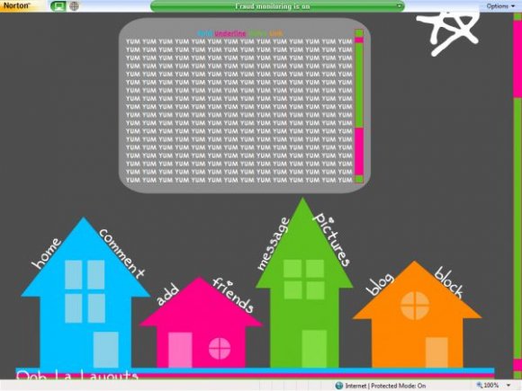
I agree with one of the other users called JESUSISTHEbESTthing. Personally, when I do my layouts (there aren't any up here yet but hopefully there will be soon), I do watermark the ones I consider 'high risk' to be jocked, stolen or used by someone claiming it's their own work (maybe for a school project or a competition where money is awarded. But I wouldn't have considered making the credit so big that it's that noticeable. It also makes this layout look more childish than it already is (crayon-drawn houses).


I've just asked the same question on your latest layout but i came across the same problem when i tried to put this as my layout. In the preview it shows different color fonts for bold/italic etc fonts but not when you put it on your myspace. CAn the font color be changed at all? Cos i love your layouts but i want some color in my text. If not thats something to work on maybe?

if you could make one without the star I would totally use it!


i think this is quite creative, though i'm not fond of the single star above the entire lyt and the credit is a little too large for me


this is really neat.
i love the house navigation.
the color choice is great.
so unique, creative and different...
i just love this.
*adds to favorites*

i love the contrast of the colors but i would have liked to see a lot more stars in the backround maybe even a moon? any way its cute


Yep... very unique...
Just that Ooh La Layouts link on the bottom is kind of big. But its credit I know...


Add Comment
You must be logged in to comment
Layout Details
| Designer |
oohlalayouts
|
| Submitted on | Oct 6, 2007 |
| Page views | 54068 |
| Favorites | 296 |
| Comments | 16 |
| Reviewer |
IVIike
|
| Approved on | Oct 6, 2007 |