The Nightmare Before Christmas (comments)
Displaying 1 - 20 of 22 comments

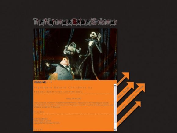
I think if you were going to use orange with this then maybe a dark, dark orange.
As it is right now, this bright orange clashes with the Gothic Nightmare Before X-mas theme. Otherwise, I like this design.

I'm not a big fan of this movie, but I love the way the layout is set up! [:

I don't like the orange at all it looks to halloweenish I think it would ahve been better if it was a blakc and white theme instead. Also I would love you longer than forever if you could make a Jack and Sally one.
I'm having problem with the text box - at first I put in my own comment box, and then it turned the background half black, half orange. So I took it out, and now it looks all white :/ how do I get the plain orange background?
if you make a really good one of jack and sally i will love you forever!!!!!

:) I will be fixing the colors of the fonts soon enough.
Sorry for the inconvenience!

i do not like the "about me" font and text effects that you used.
i like the arrow navigation but i don't think it goes with the rest of the theme.
Thanks I love it. It's my favorite movie ever. I have a song from it too, so it goes perfect. Thanks again your amazing!!!


the nav is great.
i don't like the gray font color, its really hard to read against the orange background

i like what you did with the image, but i don't like the arrows or colours.
good job! (:
beautiful :D
ill prolly use this when we get a little closer to halloween

the font is hard to see, but other than that, pretty awesome layout. ^_^
Yeah, I think you should make the font colour black or something dark cuz it's hard to see. =/ Other than that, really cool!

The banner is very nice but the bright orange doesnt seem to match for me..


Add Comment
You must be logged in to comment
Layout Details
| Designer |
jester602
|
| Submitted on | Oct 6, 2007 |
| Page views | 27001 |
| Favorites | 109 |
| Comments | 22 |
| Reviewer |
Insurmountable
|
| Approved on | Oct 6, 2007 |