Designer's Comments
Look carefully for specific instructions
If you have any questions about this layout you can send me a message here or on my myspace.
myspace.com/marinarae
-PLEASE READ DIRECTIONS BEFORE ASKING ME QUESTIONS-
A lot of people keep asking me the same basic questions, though I think in my layouts I kept it pretty simple.
Follow these simple directions to use a MarinaGrafix div overlay.
I hope this helps! XD
-------------
1. Open your Profile Editing page.
2. Delete EVERYTHING from EVERY field (about me, heros, interests, etc...)
3. Press save.
4. Copy and paste the layout parts to the correct section. (About me and I'd Like to Meet)
5. DO NOT PRESS SAVE. This will change the xxx's into MSP links!
6. Open a separate tab/window, and go to your myspace profile.
7. Copy your Friend ID digits. It's written in the URL in the address bar.
8. Go to the About Me section with the new layout code.
9. Find the XXXXXX's in the about me section, and replace them with your friend ID (paste them in there.)
10. Press SAVE!
If you have any questions or problems, you can message me on my myspace: myspace.com/marinarae
Also, with your text in the about me, I advise using html breaks. It's just easier to read and deal with.
Using This Layout
For specific instructions read designer's comments
- This is a div overlay layout, html knowledge required!
- 1. Log into myspace.com
- 2. Click on Edit Profile (Profile 1.0)
- 3. Copy (ctrl c) and paste (ctrl v) code to the specified fields
Layout Comments
Showing latest 10 of 11 comments

really cute!

this layout is adorable i loove it ! =]

gosh i love this lyt make more =]

I love this I think it's
really cute. however, the nav dissapointed me... just try spazzing it up more!

Is there a color you'd think would look good? Maybe just black, or white? Different font/bigger text? :] I'll try some things and see what I can come up with. I love the feeback I'm getting though. It helps a lot. :] Keep it coming, in a positive way ofcourse!

i do not like that the navigation is blue.
i also don't like how there is no pattern to the navigation because you flip flopped between the (.) and (+)... i just don't like the navigation....
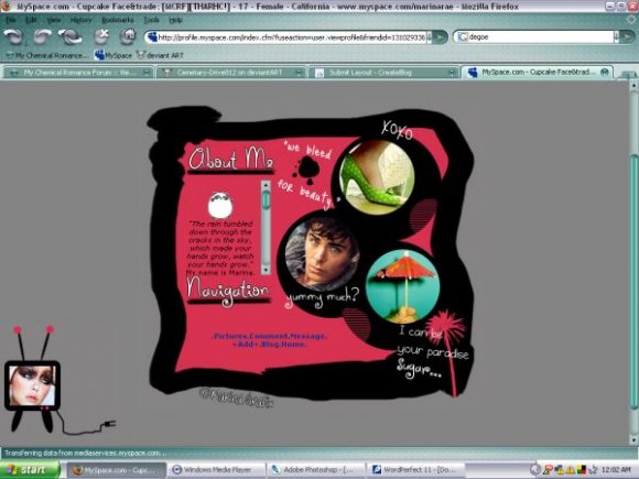
however i think the layout over all it very very cute. i love the circles and i love the tv at the bottom right.
you had a great idea and you did an overall good job...
but i think you need to redo the navigation and resubmit and i think that it would be a lot more popular.

the about me section is sooo small :)
i like the colors, but i think you could've done much more with the nav
Thanks for the imput! I do agree with the navigation. I'm trying to work on those on one of my new ones. :] This actually was made for my personal use, but I liked it so much I just wanted to be available.
Do you have any suggestions with the navigation? I know some people like Schizo Layouts have their navigation buttons as part of the picture, so i'm trying to work with that. :]

I agree with [Synesthesia] the nav could be better. but i like it overall. :D. Good Job.!

The pictures and quotes seem kind of randomly thrown together, and I think the navigation could be better. I like the brushes used for the quotes and headers, though.
Layout Details
| Designer |
MarinaGrafix
|
| Submitted on | Oct 6, 2007 |
| Page views | 34,345 |
| Favorites | 97 |
| Comments | 11 |
| Reviewer |
IVIike
|
| Approved on | Oct 6, 2007 |