wishing you were here (comments)
Displaying 1 - 14 of 14 comments


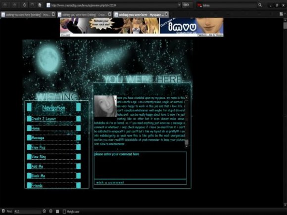
I like it. Even the Navigation. It's different and appeals to me. I can't get my profile map to show up right, but I'll figure it out eventually

try to add more colors
you should also try to redo this laout, because you have a great idea going! =D

i think this is okay...i'm not fond of the navigation, i think it's way too large, as is the comment box in my opinion. but i think you've got great colors and an awesome idea.

Very nice, Im not a fan of the font but still great job!

It's pretty good, but I think the font should be something other than Comic Sans. It looks too...kiddish and unprofessional, kind of.

I like this layout its very nice. I really don't think its plain contrary to others comments. The navigation is just fine. I like the glowing text.

I like the concept but not the way you esecuted it. It looks really plain. try to incorporate more of a color deviation next time.

your navigation box is a lil small
i really like it but its not layout worthy for my profile sry :O

don't really like the glowing text, it makes it feel more blurry or something. i think the navigation is ok, just a bit big

i do like it.
i love the colors.
but i agree, not a fan of the navigation.


Add Comment
You must be logged in to comment
Layout Details
| Designer |
michellekdo
|
| Submitted on | Oct 1, 2007 |
| Page views | 33765 |
| Favorites | 209 |
| Comments | 14 |
| Reviewer |
IVIike
|
| Approved on | Oct 2, 2007 |