Vista Style (comments)
Displaying 1 - 20 of 27 comments


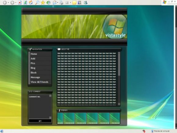
wow, this is so nice and clean. i love the headers and the about me area. great job.

Where it says Friends here , What shoul I add and where , that is confusing me, but i like it a lot.. its really nice.

I love this layout, but it almost seems too "busy", if you know what I mean. Very nicely done though. I love the navigation hovers.
The coding is wrong actually, for Hex links. If you're going to do those you have to seriously specify the color in the code, if you don't then MySpace thinks its a width, and instead takes out the original design that the Hex Links were suppose to create. And in IE it causes the links to jump all over the screen. However, I have found a way to fix it completely, if you wanna know just throw me a PM, I'll get back to you.
For the links on the left-side, there's bullet points and the links are in blue colored and stuff. :3 And the huge white spot. O.o Other than those, it's absolutely gorgeous! :D I love you! ^_^ ThANKKKKZ. [:


yeah the BG leaves a big white area on the right. other than that pretty cool.


haha awesome
i had windows vista
but then the key expired
lol oops

that's really cool, but like what has already been said, there's a huge white spot on the right :(

really nice quality, doesn't fill up my screen either so there's a huge white section

Nice!
What program did you use to make it???
Please reply to me in PM (Provate Message)
Add Comment
You must be logged in to comment
Layout Details
| Designer |
delicioustyle
|
| Submitted on | Sep 29, 2007 |
| Page views | 18742 |
| Favorites | 95 |
| Comments | 27 |
| Reviewer |
IVIike
|
| Approved on | Sep 29, 2007 |