Justin Timberlake (animation) (comments)
Displaying 1 - 18 of 18 comments


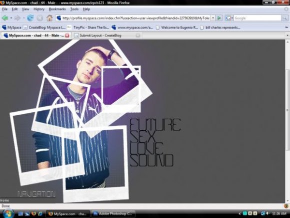
hmmm, the placement of the polariods looks a little odd. And I think you should have made the opacity a bit stronger, and maybe added a drop shadow. But other than that, I like the idea.


the top part was fabulous (polaroids and animation), but the rest was just boring.


i like the polaroid idea but they could of been made stronger and not sure about the aligning either i agree its too far to the left and about me to the right but good layout. do more in this style!

grr... CB didn't post the rest of my comment... 2nd time this happens
I said, the animation is a nice touch to the layout, but your Polaroids look a bit messy, taking alot away from your layout header
i agree with brooklyneast05 on its position and how odd it looks off to the left but its nice you made a justin timberlake layout and with the title of his latest album... which i have to say is pretty f*ing hot

ohmygoodness! this is the freaking best layout on createblog!

oooooooo....this is great. i think u shoudld do this with a few more different artists. i really love it.

i coulda used a bit more work but its cool how its animamated

i don't like how far to the left it is, and i dont like how far the about me sticks out to the right making it unbalanced compared to the top main image
its a good idea though
Add Comment
You must be logged in to comment