Memoirs of Autumn (comments)
Displaying 1 - 20 of 26 comments

Hey, didn't you use brushes from aethereality.net, too? Because it looks like you used her Eye of the Beholder brushes... It's a very cute layout, though.

I absolutely love this layout! My one question is how do I get my friend's pictures in their designated friend boxes? The links are there, but you just can't see the pictures. :)
im using this layout but how do i put the music player where i want it to be?
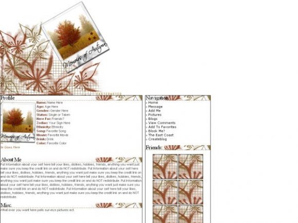
btw, beautiful layout
i love how this layout looks. but i dont like how the friends are set up. you know how you have it by two. i think that could maybe be scrolling since if people have more than 8 then the layout wont make a scroll bar.
but other than that, i like it.
I think it would look nicer if the background was another colour, something closer to autumn, ya know? Other than that, very nice~ =]

nice to know i started a long icon trend in layouts =)
nice to see the image turned into a DIV layout


so this is pretty much the same as the new york layout, only with different colors and graphics?

love it :]
i love the colours
i love how u made it.
it looks awesome!

It's cool and all, but it's too bright. I would've put in a darker background instead of the white.

I'm editing that right now... it got messed up on cB's servers I have to put in a new code
Add Comment
You must be logged in to comment
Layout Details
| Designer |
IVIike
|
| Submitted on | Sep 20, 2007 |
| Page views | 28192 |
| Favorites | 168 |
| Comments | 26 |
| Reviewer |
themarkster
|
| Approved on | Sep 20, 2007 |