Team Hudgens (comments)
Displaying 1 - 12 of 12 comments


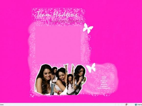
a bit too much pink; and font is a bit pixely. good job for a first layout though.


Its not one of my favs. :( I'm sure someone else would like it though :)


you're joking ..right? i only checked to see if this got deleted or if you at least admitted it.furthermore you are in no position to judge anyone else.but since you gave credit let's just forget about the whole thing,k?.

kimchikimi, i deleted comments that were abusive towards vanessa. therefore, yours must be. and you must be sad to keep checking this page for comments so...

ok i wasn't even mad,but to delete all the comments of people just because you don't want to admit that you stole someones exact coding is messed up.im reporting you.

I'm not a real big fan of this one, either. It just looks badly done to me. Sorry. :(


The font is pixely, you can still see the water mark on the images, and it's a too bright. Sorry, but I'm not a big fan of this.
Add Comment
You must be logged in to comment
Layout Details
| Designer |
babygurl1853
|
| Submitted on | Sep 15, 2007 |
| Page views | 9711 |
| Favorites | 15 |
| Comments | 12 |
| Reviewer |
brownsugar
|
| Approved on | Sep 15, 2007 |