Designer's Comments
Look carefully for specific instructions
MUST HAVE HTML KNOWLEDGE
I made this on a 1280 x 800 ... so If you are using a different resolution the DIV Boxes might be off... If so, Feel Free to play with the numbers and fix it to fit your screen.
For the Navigation Bar: Fill in the correct URL address with yours...
Using This Layout
For specific instructions read designer's comments
- This is a div overlay layout, html knowledge required!
- 1. Log into myspace.com
- 2. Click on Edit Profile (Profile 1.0)
- 3. Copy (ctrl c) and paste (ctrl v) code to the specified fields
Layout Comments
Showing latest 10 of 13 comments

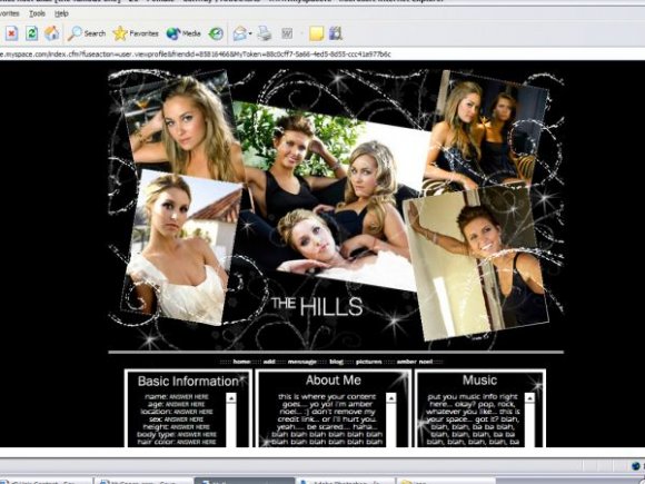
The Hills is one of my fav shows! This is great =)
i really like this layout but where do i put my friend ID?

oh jeeze i love it! and i love the hills!

I wonder if u can make the hills on defult layouts?
no heidi?! well that makes me happy.....you did a nice job!!! i like it alot!!! they are great choices for pics too!!!
I think ur layouts are nice. I was wondering if you can create a layout just like this one, but instead of having pictures of famous Celebrities, people have an option of putting their own pictures up. That would be hot!!
No Heidi so you get bonus points already.
I'm a huge fan and those image choices are great; make all the girls look fantastic (not difficult I know)
I agree you should have put a border around the header, just so it's contained and presented better, and I think you went a little over the top with the brush use, though I like the general idea of the effect you were going for.
I don't like the blocky set up of the content. I just think a little more creativity is always possible when it comes to content and that it doesn't have to be quite so straight forward as three boxes side by side.
That being said, this isn't bad. I quite like it.

it lookzz niice =)

I like everything.

o and just to let you know the scrolls dont work at all at least on mozilla they dont
Layout Details
| Designer |
PINKLollyPOP
|
| Submitted on | Sep 14, 2007 |
| Page views | 19,495 |
| Favorites | 66 |
| Comments | 13 |
| Reviewer |
IVIike
|
| Approved on | Sep 15, 2007 |