Designer's Comments
Look carefully for specific instructions
MUST HAVE HTML KNOWLEDGE
I made this on a 1280 x 800 ... so If you are using a different resolution the DIV Boxes might be off... If so, Feel Free to play with the numbers and fix it to fit your screen.
For the Navigation Bar: Fill in the correct URL address with yours...
Using This Layout
For specific instructions read designer's comments
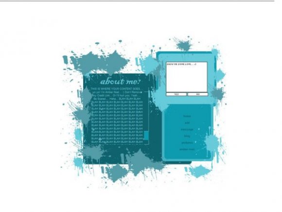
- This is a div overlay layout, html knowledge required!
- 1. Log into myspace.com
- 2. Click on Edit Profile (Profile 1.0)
- 3. Copy (ctrl c) and paste (ctrl v) code to the specified fields
Layout Comments
Showing latest 8 of 8 comments

It's pretty cool but I think you overdid it with the splats. Otherwise, good job. :)

Excellent layout! :3 Teal is my favorite color. I'm definately going to use this. xD You should center it a bit more though o_o.. It gives a, "Fuck, I'm falling off the page!" kind of feel. Lol.

Person below me...SHUTUP!
This layout rocks.

the splatters are too repetative, and not placed very well, coulda come out alot better with a lil more time on placement and detailing
A big part of me is screaming not to like it, but I kind of can't help it, I think mostly because of the colour scheme and the way you've picked the accompanying shades so well.
It's a little fresh, but not too bright, so it's a nice balance.
In terms of creativity, hopefully you won't be surprised when I say you don't score that highly, though somehow you do manage to set up the content quite well. It doesn't come off as blocky.
You give your navigation too much space, considering the actual size of the links. I think compress that down, and put in either a friends' marquee between the comment box and navigation, OR, a music player. Think the music player might work better else the right side of your layout might look too busy.
I don't like the header font for "about me" but like I said, as much as I don't necessarily want to like this layout, I somehow do.

nice colors :]

Another splatter layout? These are popular lately...
I like this one. But I think the splats right about the 'about me' are a little out of place looking.

you should do something more with the Navigation,, it looks kind of ..plain. apart from that i love it. :D
Layout Details
| Designer |
PINKLollyPOP
|
| Submitted on | Sep 14, 2007 |
| Page views | 26,950 |
| Favorites | 224 |
| Comments | 8 |
| Reviewer |
IVIike
|
| Approved on | Sep 14, 2007 |