Pleasantville (comments)
Displaying 1 - 17 of 17 comments

how do yhu make it not beeee a pop out new page when they click on yhur links????


love it love it love it!!! pleasantville is like one of my favorite movies =]


Thanks flaymzofice.
I really enjoy reading you're C&C. (=
Yeah, "About The Layout/CSS TAGs/etc." are all editable. You can take them out and replace whatever you want. It's just how I want to present the layout and it's attributes of it.
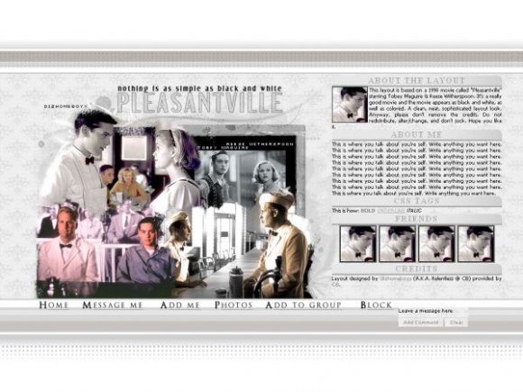
As for the comments, I had no idea where to place it, so I decided it to put it near the bottom color lines. I didn't want it to put it where the main div was. (x
& Thanks.

Oh and I also forgot to add - like the hover effect on the friends links too! Think you're the first person I've seen to do that, as far as I can remember. Funny how nobody though to use hovers on friend images, but glad you broke ranks. Like that a lot.
Dude, this rocks out.
A question to start though: having never used a pre-made layout, are the "CSS TAGS" and "ABOUT THE LAYOUT" headers editable? Or will people be stuck with them when they actually use it?
I love your execution of this; I wasn't a huge fan of the movie - I'm not into retro looking stuff, whatever the intentions - but you made it look like a really fun film with this. My favourite part has to be the navigation, weird as that may seem.
It's not even the hover over; I think it's the combination of the font colour, hover, underline and font choice. It just looks so CLASSIC and professional. It makes me squeal inside.
The extraction/blending around the images is a little awkward at times, but I guess it does suit the effect you were going for. Just not a personal favourite of mine is all.
I like the mix of colour and b/w images; makes a lot of sense though most people probably would have overlooked this.
Clever not to use boxes around the content; despite it only being an absence of a few lines, this doesn't appear blocky at all and is in fact quite stream lined and pretty presentable.
My only "erf?" moment was the comment box. Erm, it seems a little...misplaced? Or is that just my screen res (768x1064)?
Big fan of this execution and layout.


I really like how this one is set up. Never seen the movie, but I like this layout! :D


never seen the movie but i really llike the way you set up your layout , beautiful!

i love this movie..i watch it every time it comes on..i am so happy someone did a layout..great execution!..Def a fave!

Add Comment
You must be logged in to comment
Layout Details
| Designer |
Relentless
|
| Submitted on | Sep 13, 2007 |
| Page views | 9693 |
| Favorites | 53 |
| Comments | 17 |
| Reviewer |
IVIike
|
| Approved on | Sep 14, 2007 |