Panic! at the disco (comments)
Displaying 1 - 12 of 12 comments


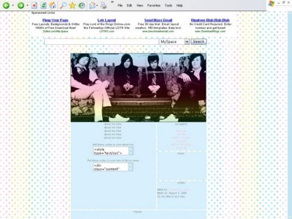
looks like you're on team brent. :|
otherwise, this is good :]]
Posted by resrchmnkygrl6 on Nov 7, 07 11:39 pm

well i think you did a good job...
:)
the only thing that i would change, is the text color on the navigation.. only becuase it's hard to read. :)
besides that, i like :)
Posted by PINKLollyPOP on Sep 17, 07 3:02 pm


I'd be GREAT if brendon wasnt in a box.
damn, I really love it too.
Posted by itsallhushhush on Sep 15, 07 4:17 am


I like this,, but yeah, the colors are a little too light. Good Job though! :D
Posted by alecreations on Sep 14, 07 7:51 pm


This is really good. The only thing I notice is the color of the links...maybe it's just my screen, but it's very light against the background color and slightly hurts my eyes.
Posted by GoneFishing on Sep 14, 07 5:35 pm

I don't like them much but the banner is cool. :D
It's a little dark compared to the rest of the layout though.
Posted by schizo on Sep 14, 07 5:14 pm
Page 1 of 1
Add Comment
You must be logged in to comment
Layout Details
| Designer |
xastallaslyons
|
| Submitted on | Sep 13, 2007 |
| Page views | 13027 |
| Favorites | 48 |
| Comments | 12 |
| Reviewer |
IVIike
|
| Approved on | Sep 14, 2007 |