Pink And Black Splatter (comments)
Displaying 21 - 29 of 29 comments

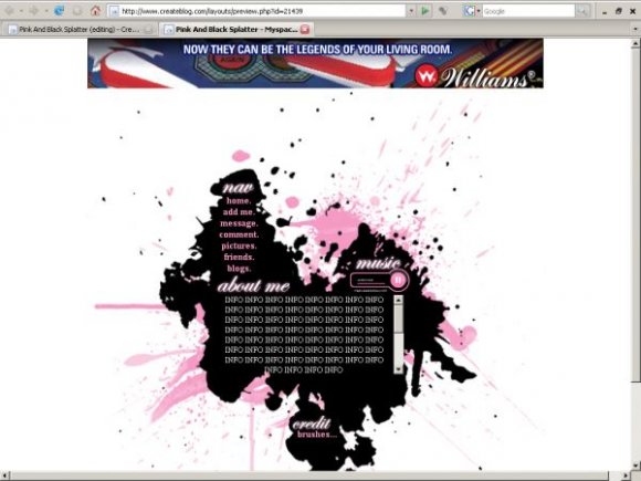
Even though spatter layouts seem to be en vogue right now and there have been almost mass submissions (and acceptances) of them, this one does stand out in that you haven't just randomly used brushes to make a layout. The shape of the spatter suggests there was some thought put into the set up and organisation of this, which is always nice.
It's really well integrated, without being obviously designed that way - after all, how can you control how a drop will fall? I like the way all the content elements are fit in - the navigation, music player and obviously, body text.
Nice job.
Posted by flaymzofice on Sep 13, 07 5:24 pm


« Prev ·
Page 2 of 2
Add Comment
You must be logged in to comment
Layout Details
| Designer |
TaintedSakura
|
| Submitted on | Sep 12, 2007 |
| Page views | 68623 |
| Favorites | 532 |
| Comments | 29 |
| Reviewer |
Insurmountable
|
| Approved on | Sep 12, 2007 |