the black escape (comments)
Displaying 1 - 15 of 15 comments

P.S. And Poppi is right. It should have a BLOCK link on it and it doesn't seem to. How could this have been accepted and approved WITHOUT it. I know I read that in the submissions requirements that you have to have a block button. Is there one?
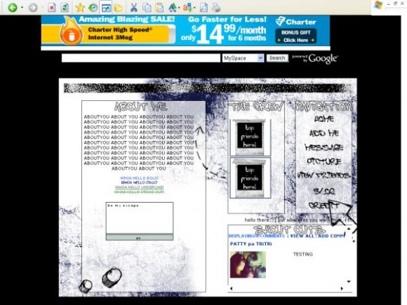
I love the idea with the friends moving UP like that with the tape on the images, but I despise the font used in this. I guess it's supposed to be graffiti but it just looks like...idk. The white on blue color does NOT look good for this. Black on white would've (or could have) looked a little better ( at least to me). I wouldn't use this, I don't think, because the font bothers me that much.


nice layout... but my in my top friends pic appears the example image :S
Really like this one, great job.
I can't get my comments to show up, can someone help? Thanks

Yea I can still see my profile behind this so yea how do i get it to only show the layout?BC yea idk ho can someone help me?

nice simple design. you should really add block in the nav links because you can be deleted for not having on there

is it supposed to be transparent?
cause i keep seeing these black rectangles through the layout.
any clues?
umm the blog link doesn't work soo could you help with that. but other than that i love the layout.

i think the scrolling friends and scrolling extra at the bottom of it is a little much. otherwise, it's pretty good.

Add Comment
You must be logged in to comment
Layout Details
| Designer |
pattycake
|
| Submitted on | Sep 7, 2007 |
| Page views | 50204 |
| Favorites | 276 |
| Comments | 15 |
| Reviewer |
karmakiller
|
| Approved on | Sep 8, 2007 |