FREEDOM - Know Your Enemy (comments)
Displaying 1 - 12 of 12 comments

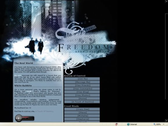
The blending is really good- and I love the colors =] The Matrix is my absolute favorite movie of all time.


Thanks for the feedback! General opinion suggested I take off the navigation brackets - I have done. :)

i really like this. i just don't like the brackets around the nav...i think you could've left the brackets off and the lyt would still be just as nice

You've submitted all of three layouts so I think you are the designer who jumped into my favourites list fastest.
I like your approach to layouts; the idea is very well executed, clean, uncluttered, but with the right graphic to content ratio so as to aesthetically please as well as being practically useful.
The colour scheme for this one is great; it's dark but hopeful and resonates of the Matrix theme. It's cool you didn't go with the green usually associated with it - this shade of blue is less foreboding but also more real. I love it.
My favourite part of this entire layout is the header; I couldn't even pick all the individual graphical elements you put into creating it, but that's part of its appeal.
If I were really picky, I'd say the navigation looks a tiny bit odd without lines separating each link, but that's a pretty minor, individual issue.
Oh and also, there's no myspace player in FF. Unless my laptop decided to be a dickwad and just not load it...
Great job.


i'm not a big fan of the matrix, but this layout is amazing. good job. :)

Amazing banner. It's so pretty. My only problem is is how the words in the nav have brackets around them...
Add Comment
You must be logged in to comment