hollister (comments)
Displaying 1 - 12 of 12 comments

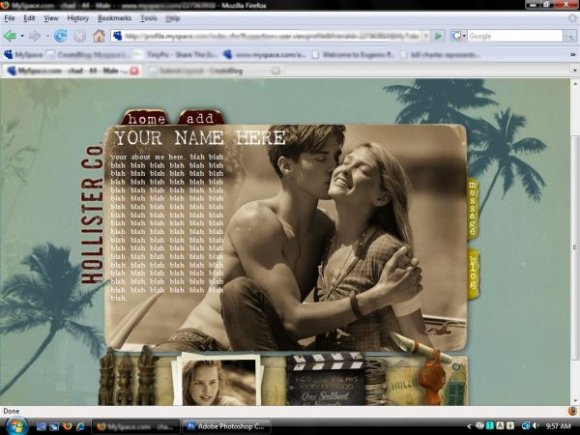
love this one! great roll-over effects. maybe it couldv'e been on all the links? idk.

hey i loveee this layout, is there ne posible way of putting a marqee of friends on it? or a comment box?
I LOVE IT =]]
Great job
It's just like the site.
What do you mean "so"..?
You basically didnt do anything..=/
And you could get sued for copyright..
And..
"okay so this layout was made by me and only me"
What?!
All you did was take a screenshot. And you "so" confirms that..
All you did was take a screenshoot of the Hollister Website, and label things. =/

IDK this just seems like a copy cat of their website to be honest... no originality, though I do like the rollovers :)

The idea is really good because it actually looks like the website... however, the name has a scroll bar which really kills it for me

nice layout.
I think that brand based layouts are pretty stupid though. Just my opinion :P

i love the colors and i think the nav is really cool
I actually really like this; it's well contained, and the colours work really well, it's really chilled and laid back.
I do agree there are a few minor tweaks which could have made this a lot better, but overall it's not badly done. I love the two hover over enlargements - reminds me of those msn games, especially the Jewel Quest one, or whatever it was called. I think that's really neat - all you need is the sound effects.
I don't really like the content space - feels like you just picked a random spot for it to be, forcing it upon the image, rather than creating a specific dedicated content area. Other than that, I like this.

i have wanted to do this a ton of times. i feel this should have been executed better though:/
Add Comment
You must be logged in to comment