Designer's Comments
Look carefully for specific instructions
DO NOT REDISTRIBUTE
DO NOT JOCK/STEAL CODES
DO NOT EDIT THE IMAGE PLACED ON THIS LAYOUT
All forms of flash might not be moved to the top left corner , if it does please look for and remove the following code
Directions:
1. make sure that you replace all the XXXXXX with your friend id # (just the number) before you save the layout (all links become MSplinks once saved on myspace)All that needs to be edited is in the I'd like to meet section.
2. take into account that i made this layout for you... it doesn't mean that you can remove the credits or claim this as yours.
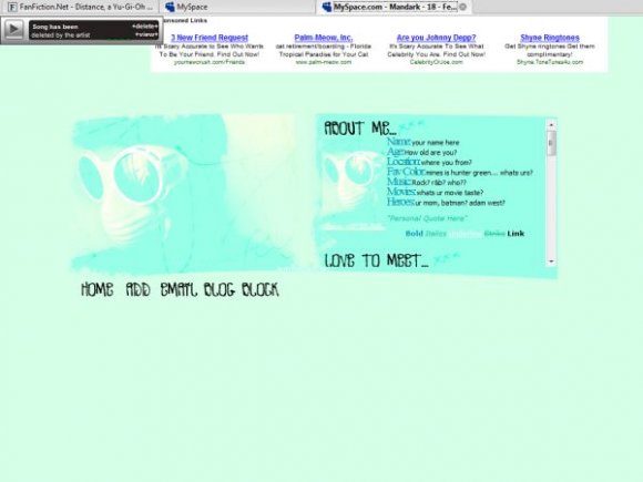
note: sorry about how bright this layout is... the original was a stock image I decided to mess with because it was late and I was hella bored... and yes that person with the weird hair and goggles is me with a wig and willy wonka goggles =)
Credit:
Model: Amanda P.
Html help: Markster (http://the-markster.net)
Brushes: http://www.rainharbour.net/
http://77words.livejournal.com/
Using This Layout
For specific instructions read designer's comments
- This is a div overlay layout, html knowledge required!
- 1. Log into myspace.com
- 2. Click on Edit Profile (Profile 1.0)
- 3. Copy (ctrl c) and paste (ctrl v) code to the specified fields
Layout Comments
Showing latest 10 of 11 comments

Looks nice, but no offense, but those credits are waaaay to long. There would likely be more credit text than stuff I wrote if I used this layout. Isn't just one small link enough? :/

sorry for double posting, but you have a huge horizontal overflow at the bottom in FF
i love the color amanda great job

how did u move the music player

this is really nice

dang. mad bright. o.O but i like :) and apperantly everyones digging the font for the nav hehe... nice work as always :)

Yes, Amanada. The navigation looks awesome .. not because you used my code for it, but because you made it look good. Haha. But yeah, I already told you about how the image looks a little too bright for me. But I still really like it. :] Good job, Mandie.

Nice. I love the font used for the nav.

not your best, but like the nav! :)

cool nav.
Layout Details
| Designer |
Blaqheartedstar
|
| Submitted on | Sep 1, 2007 |
| Page views | 12,000 |
| Favorites | 27 |
| Comments | 11 |
| Reviewer |
brownsugar
|
| Approved on | Sep 1, 2007 |